Over the years, the way we design websites has evolved considerably. From table layouts to floats to today's modern layout techniques, a lot has changed. One of these modern techniques is Flexbox, a powerful and flexible layout method that allows developers to create complex layouts with ease. In this article, you'll learn why Flexbox is better than older layout methods, and how you can use it effectively to take your web projects to the next level.

A brief look back: Before Flexbox 🕰️
Before Flexbox was introduced, web developers didn't have many options for creating layouts. The two most common methods were using floats and inline blocks. Both methods served their purpose, but they came with a variety of challenges and limitations.
Floats: The Origin of Layout Creativity 🚣♂️
Floats were not originally developed for layout purposes, but to allow text to flow around images. Nevertheless, developers have used them creatively to create layouts. Let's take a look at a typical float layout:
<div class="container">
  <div class="box float">Box 1</div>
  <div class="box float">Box 2</div>
  <div class="box float">Box 3</div>
</div>
.container {
  width: 100%;
  overflow: hidden; /* For clearfix */
}

.box {
  width: 30%;
  margin-right: 3%;
  float: left;
}

.box:last-child {
  margin-right: 0;
}
In this example, we have a typical arrangement of three boxes next to each other with the float property. However, this method had some serious drawbacks:
- Clearfixing: A common problem with floats is so-called "collapsing", where the parent element loses its height when all children are floated. To fix this, a clearfix had to be applied, either by adding an empty div or by using
overflow: hiddenon the parent element. - Incompatibility with vertical alignment: Floats do not provide a built-in way to vertically align elements. This made it difficult to achieve consistent vertical alignment of content within a container.
- Centering: Centering elements with floats was a challenge and often required complicated workarounds, such as using
margin: 0 autoor negative margins. - Responsive Design: With the increasing importance of responsive design, working with floats became even more complicated. Developers had to introduce media queries and additional CSS rules to ensure that layouts worked on different screen sizes.
Inline block: A half-baked solution 🏗️
Another method that was often used was the use of inline blocks. This method allowed developers to arrange elements next to each other without them overlapping. An example:
<div class="container">
  <div class="box">Box 1</div>
  <div class="box">Box 2</div>
  <div class="box">Box 3</div>
</div>
.container { text-align: center; /* Centers the inline blocks */ } .box { display: inline-block; width: 30%; margin-right: 3%; } .box:last-child { margin-right: 0; }
While inline blocks solved some of the problems of floats, they also brought new challenges:
- Whitespace problems: Since inline block elements are treated like text, unwanted whitespace is created between the elements, which must be removed manually, making the code unnecessarily complicated.
- Difficult width calculation: The manual calculation of widths, especially in combination with margins, was often error-prone and complicated.
- Limited layout control: Inline block offers only limited options for controlling layouts, especially when it comes to distributing elements evenly.
Flexbox: The game changer 🎮
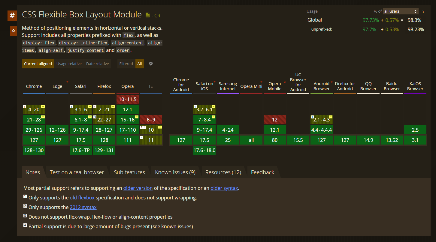
With the introduction of Flexbox, many of these problems have been eliminated. Flexbox is a layout method specifically designed to be flexible and user-friendly. It offers a variety of features that make creating layouts much easier while increasing flexibility. The nice thing is, Flexbox is now standard in all browsers (and has been for quite a long time):

The basics of Flexbox 📚
To use Flexbox, simply set display: flex to a container. All direct children of this container then become flex items. This means that they automatically adapt to the available space and behave according to the specified flexbox properties.
<div class="container">
  <div class="box">Box 1</div>
  <div class="box">Box 2</div>
  <div class="box">Box 3</div>
</div>
.container { display: flex; justify-content: space-between; } .box { width: 30%; }
With this simple example, we have created a layout that is:
- Easy to understand: Using Flexbox is intuitive and easy to understand, even for beginners.
- Automatically centered and distributed: Using the
justify-content: space-betweenproperty, the boxes are distributed evenly and take up the remaining space in the container. - Responsive is: Flexbox automatically adapts to different screen sizes without the need for additional media queries.
Flexbox properties in detail 🔍
Flexbox offers a variety of properties that are specifically designed to make layouts flexible and adaptable. Let's take a closer look at some of the most important properties:
flex-direction 🚦
With flex-direction you can determine the direction of the flex items within the container. There are four possible values:
row: The default direction, in which the items are arranged horizontally from left to right.row-reverse: Likerow, but the items are arranged from right to left.column: The items are arranged vertically from top to bottom.column-reverse: Likecolumn, but the items are arranged from bottom to top.
Example:
.container {
  display: flex;
  flex-direction: column;
}
In this example, the boxes are arranged vertically instead of horizontally, which would be difficult or impossible to achieve with floats or inline block.

justify-content 📏
With justify-content you can control the distribution of flex items along the main axis (horizontally, if flex-direction is set to row). There are several options:
flex-start: The items are aligned at the beginning of the container.flex-end: The items are aligned at the end of the container.center: The items are centered in the middle of the container.space-between: The items are distributed evenly, with the first item at the beginning and the last item at the end of the container.space-around: The items are distributed evenly, with equal spacing between them.space-evenly: The items are distributed with equal spacing, including the space before the first and after the last item.
Example:
.container {
  display: flex;
  justify-content: space-around;
}
Here the boxes are distributed evenly with equal spacing between the boxes and the edges of the container.

align-items 🎯
With align-items you can control the vertical alignment of flex items along the cross axis. There are several options:
flex-start: The items are aligned at the start of the cross axis (at the top ofrow).flex-end: The items are aligned at the end of the cross axis (at the bottom ofrow).center: The items are centered in the middle of the cross axis.baseline: The items are aligned along their text baseline.stretch: The items are stretched to fill the entire height of the container.
Example:
.container {
  display: flex;
  align-items: center;
}
In this example, the boxes are aligned vertically in the center of the container, regardless of their height.

flex-grow, flex-shrink and flex-base 🔬
These three properties give you control over how flex items behave in relation to the available space.
flex-grow: Determines how much a flex item can grow relative to the other items. A value of 1 means that the item will grow to fill the available space.

flex-shrink: Determines how much a flex item can shrink, relative to the other items. A value of 1 means that the item will shrink if there is not enough space.

flex-base: Determines the base size of the flex item before applyingflex-growandflex-shrink.

Example:
.box {
  flex-grow: 1;
  flex-shrink: 1;
  flex-base: 30%;
}
In this example, the boxes increase or decrease in size depending on how much space is available in the container.
order 🔄
With the order property, you can change the order of the flex items without having to change the order in the HTML code. The default value is 0. A lower value means that the item is displayed further forward.
Example:
.box:first-child {
  order: 3;
}

.box:last-child {
  order: 1;
}
In this example, the first item is displayed last and the last item is displayed first, regardless of the order in the HTML.

Flexbox vs. older methods: A detailed comparison 🧠
To better understand the advantages of Flexbox over older layout methods, let's take a look at some specific scenarios where Flexbox makes a developer's life much easier:
Float vs Flexbox
| Float | Flexbox |
|---|---|
Elements flow left or right and often require clear. | Elements are flexible and customizable without additional clear properties. |
| Complex clearfix methods required to fix layout issues. | Flexbox does not require a clearfix; layouts remain intact. |
| Difficult centering due to additional wrappers or negative margins. | Easy centering with justify-content and align-items. |
| Manual handling of spacing and sizes, which often leads to errors. | Automatic and dynamic adjustment of spacing and sizes. |
| Not ideal for responsive design; often requires many media queries. | Flexbox is inherently responsive and adapts to different screen sizes. |
Inline block vs. flexbox
| Inline-Block | Flexbox |
|---|---|
| Elements behave like text and inherit whitespace issues. | Elements are flexible and whitespace is not a problem. |
| Manual width calculation required, which can be error-prone. | Flexbox automatically adjusts the size of elements. |
| No easy centering or spacing possible; often requires additional tricks. | Flexbox allows for easy centering and even distribution without additional tricks. |
| Requires additional CSS to fix whitespace issues. | Flexbox eliminates these issues completely. |
| Limited layout control, especially for complex layouts. | Flexbox provides extensive layout controls that make complex designs easy to implement. |
Complex layouts made easy with Flexbox 🎨
Flexbox shines especially with complex layouts, where older methods such as floats or inline blocks often fail. Here are some examples of layouts that can be easily implemented with Flexbox:
Flexible Grid Layout 🏙️
A common scenario is to create a flexible grid layout, where elements are arranged in a grid and adapt to different screen sizes. With Flexbox, this is easy:
.container {
  display: flex;
  flex-wrap: wrap;
  justify-content: space-between;
}

.box {
  flex-base: 30%;
  margin-bottom: 20px;
}
In this example, the boxes are arranged in a flexible grid that automatically adjusts when the screen size changes. The flex-wrap property ensures that the boxes wrap when there is not enough space.
Evenly distributed navigation 📑
Horizontal navigation with evenly distributed elements is a breeze with Flexbox:
.nav {
  display: flex;
  justify-content: space-around;
}

.nav-item {
  padding: 10px 20px;
}
With justify-content: space-around, the navigation elements are evenly distributed, resulting in a clean and well-structured navigation.
One of the biggest problems with older layout methods was the centering of elements, both horizontally and vertically. With methods such as floats or inline blocks, it was often necessary to resort to cumbersome workarounds to center elements. These techniques required additional HTML and CSS code and were often error-prone, especially when used in a responsive context.
Flexbox elegantly solves this problem by providing justify-content and align-items properties specifically designed to align elements horizontally and vertically within a container.
Horizontal centering with justify-content 🧭
The justify-content property determines how the flex items are aligned along the main axis of the container. In a flexbox layout, the main axis is horizontal by default (i.e. from left to right), unless the direction is changed with flex-direction.
The most common values for justify-content are:
flex-start: The flex items are aligned at the start of the container. This is the default value.flex-end: The flex items are aligned at the end of the container.center: The flex items are aligned in the middle of the container. This is particularly useful for centering content horizontally.space-between: The flex items are distributed evenly, with the first and last item positioned at the beginning and end of the container respectively. The remaining space is distributed evenly between the items.space-around: Similar tospace-between, but with additional space before the first and after the last item, so that all items are distributed evenly.
In the context of centering, we often use justify-content: center to position the flex items horizontally in the middle of the container. This means that regardless of the width of the container, all available space is distributed evenly on both sides of the elements, making the elements appear perfectly in the center of the container.
Vertical centering with align-items 🎯
The align-items property is used to align the flex items along the transverse axis of the container. In a horizontal flexbox layout, the transverse axis is vertical, which means that align-items controls the vertical alignment of the flex items.
The most common values for align-items are:
flex-start: The flex items are aligned at the start of the horizontal axis, i.e. at the top of the container.flex-end: The flex items are aligned at the end of the horizontal axis, i.e. at the bottom of the container.center: The flex items are aligned in the middle of the cross axis, which centers them vertically.baseline: The flex items are aligned along their text baselines, which is useful if you want to align text elements of different heights evenly.stretch: The flex items are stretched to fill the height of the container (this is the default value if no specific height has been set).
In combination with align-items: center you can ensure that your flex items are vertically centered, regardless of their height or the height of the container.
Collaboration of justify-content and align-items
To achieve both horizontal and vertical centering in a container, use justify-content: center together with align-items: center. This means that the flex items are placed both horizontally and vertically in the center of the container. Here is an example:
.container {
  display: flex;
  justify-content: center;
  align-items: center;
  height: 100vh; /* Example of a full screen height */
}
In this example, the content is displayed exactly in the center of the container, regardless of its size. This is especially useful for layouts where you want to ensure that elements such as modals, popups or central content elements are perfectly centered.
This type of centering used to be difficult to achieve and often required complex hacks such as negative margins or additional wrapper elements. With Flexbox, however, this is child's play and allows you to write clean, readable and easily maintainable code.
In summary, with justify-content and align-items, Flexbox gives you the perfect solution to center elements both horizontally and vertically - something that was a constant pain point in previous CSS methods.
Flexbox for responsive designs 📱
One of the biggest advantages of Flexbox is its ability to easily create responsive layouts. Because Flexbox is inherently flexible, layouts automatically adapt to different screen sizes. Let's take a look at an example:
.container {
  display: flex;
  flex-wrap: wrap;
}

.box {
  flex: 1 1 200px; /* flex-grow, flex-shrink, flex-basis */
  margin: 10px;
}
Here we have a layout where the boxes automatically adjust to fit into the available space. As the screen gets wider, the boxes fill the extra space; as it gets narrower, they shrink to still fit in.
Flexbox vs. Grid: When you should use which method 🛠️
While Flexbox is incredibly powerful, there are other modern layout methods, such as CSS Grid. It's important to know when to use Flexbox and when to use Grid.
- Flexbox is great for single-line layouts where it's important how items are arranged along an axis. Examples are navigation bars, horizontal galleries or simple centering tasks.
- CSS Grid is better suited for two-dimensional layouts where both rows and columns are important. Examples include complex page layouts with multiple areas, such as header, sidebar, content area and footer.
In many cases, Flexbox and Grid complement each other, and it is perfectly acceptable to use both in a project. For example, Flexbox can be used to arrange the elements within a grid cell.
Conclusion: Why you should use Flexbox 🚀
Flexbox is one of the most powerful and flexible layout methods available to you. It eliminates many of the problems associated with older layout techniques such as floats and inline blocks and provides an intuitive and user-friendly way to create layouts. Whether you're creating a simple layout for a small website or a complex, responsive design for a large project, Flexbox will help you achieve your goals faster and more efficiently.
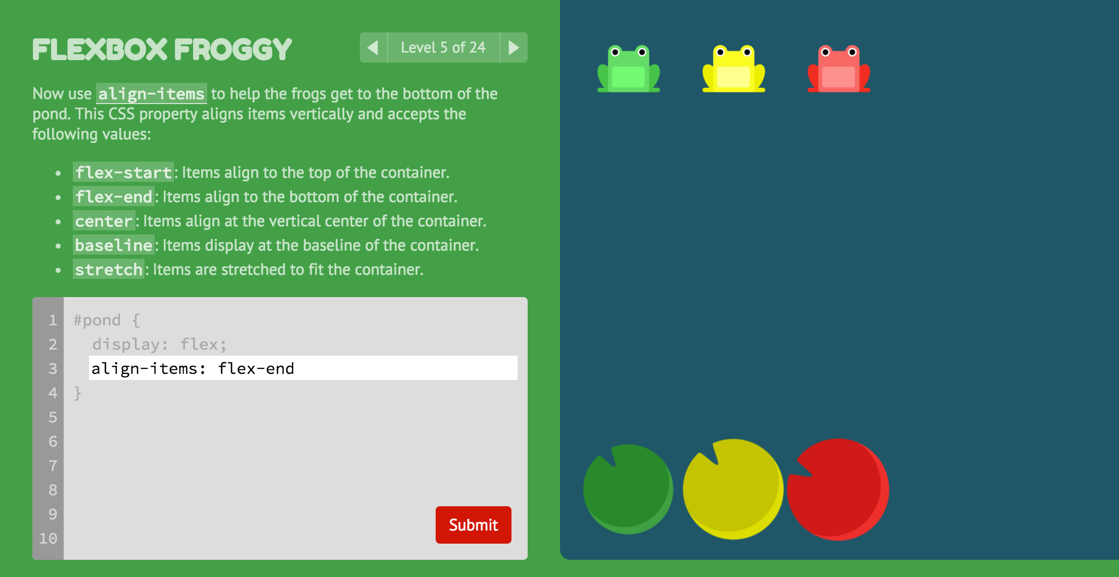
If you've been working with floats or inline blocks, now is the perfect time to switch to Flexbox. The simplicity and flexibility it offers will make your life as a web developer much easier while allowing you to create more beautiful and functional designs. You can now also test your knowledge in the interactive game 🎮
With regard to common CSS styling frameworks, such as Tailwind, it is definitely worth testing Flexbox. I have explained what exactly Tailwind is and how it works in this article 👇

Have questions or want to learn more about Flexbox? Leave a comment and let's talk about it!
Discover more articles

Warum CSS Flexbox Deine Layout-Probleme löst🧑💻
Lerne, wie Flexbox Dein Webdesign revolutionieren kann und warum es besser ist als alte Layout-Methoden! Perfekt für responsive Designs 🎨

CORS (Cross-Origin Resource Sharing) erklärt 🌐
Verstehe die Bedeutung von CORS für sichere Webanwendungen. Erfahre die Vor- und Nachteile und wie du häufige Fehler vermeidest! 🌐

Container Queries in CSS: The End of Media Queries? 📦
Container Queries put an end to viewport chaos! 📦 How to make your components truly responsive – and why Media Queries are not dead yet.

Angular and TailwindCSS: Utility-First CSS Meets Components 🎨
Angular and TailwindCSS are a powerful duo. Here's how to set up Tailwind in your Angular project and use utility-first CSS effectively.

Tailwind CSS vs. Vanilla CSS – When Is Which Worth It? ⚖️
Tailwind CSS or Vanilla CSS? ⚖️ I will show you when each approach is actually worth it – with real examples and honest pros and cons!

CSS variables: Flexible styling for your components 🎨
CSS variables make your styling more flexible 🎯 In this guide, I'll explain how to use, scope and override them in components! 🌈


