The <dialog> tag is a relatively new introduction to HTML that is revolutionizing the way we design and manage modal dialogs and user interactions on web pages. In this article, we'll explore how the <dialog> tag works, how it was done before, and why this new method is so beneficial.

What is the <dialog> tag? 📝
The <dialog> tag was developed to provide a native method for creating modal dialogs in HTML. Modal dialogs are pop-up windows that draw focus to themselves and prevent interaction with the rest of the page until they are closed. This is particularly useful for user interactions such as confirmations, warnings or forms.
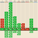
The best thing is that it is supported in all modern browsers:

Basic structure of a <dialog> tag
<!DOCTYPE html>
<html lang="en">
<head>
    <meta charset="UTF-8">
    <meta name="viewport" content="width=device-width, initial-scale=1.0">
    <title>dialog</title>
    <style>
        dialog {
            border: none;
            border-radius: 8px;
            box-shadow: 0 2px 10px rgba(0, 0, 0, 0.1);
            padding: 20px;
            width: 300px;
        }
        dialog::backdrop {
            background-color: rgba(0, 0, 0, 0.5);
        }
        #closeDialog {
            background-color: #f44336;
            border: none;
            color: white;
            padding: 10px 20px;
            text-align: center;
            text-decoration: none;
            display: inline-block;
            font-size: 16px;
            margin: 4px 2px;
            cursor: pointer;
            border-radius: 4px;
        }
    </style>
</head>
<body>
    <button id="openDialog">Open Dialog</button>
    <dialog id="myDialog">
        <p>This is a modern dialog</p>
        <button id="closeDialog">close</button>
    </dialog>

    <script>
        const dialog = document.getElementById('myDialog');
        const openDialogButton = document.getElementById('openDialog');
        const closeDialogButton = document.getElementById('closeDialog');

        openDialogButton.addEventListener('click', () => {
            dialog.showModal();
        });

        closeDialogButton.addEventListener('click', () => {
            dialog.close();
        });

        // Automatic closing of the dialog after 10 seconds
        setTimeout(() => {
            dialog.close();
        }, 10000);
    </script>
</body>
</html>
In this example, the "Open dialog" button opens the dialog box and the "Close" button closes it. In addition, the dialog is automatically opened after 3 seconds and closed after 10 seconds. The CSS ensures an appealing design of the dialog and a semi-transparent background (backdrop).
Automatic opening
The open attribute keeps the dialog open from the moment you open the page. By adding the open attribute to the <dialog> tag, the dialog will stay open automatically without requiring any user interaction. This can be useful if you want to display a message or important information as soon as the page loads.
<dialog id="myDialog" open>
    <p>This is a permanently open dialog.</p>
    <button id="closeDialog">Close</button>
</dialog>
In this example, the dialog remains open immediately after loading the page, as the open attribute is used.
Styling the backdrop 🎨
The <dialog> tag has a special ::backdrop pseudo element that can be used to style the appearance of the background (backdrop). The backdrop is the semi-transparent area that is displayed when the dialog is open and prevents the user from interacting with other parts of the page.
dialog::backdrop {
    background-color: rgba(0, 0, 0, 0.5);
}
With the ::backdrop pseudo element, you can apply different styles, such as color, transparency or even more complex visual effects to highlight the modal dialog and draw the focus to it.
Previous implementation techniques 📜
Before the <dialog> tag was introduced, developers had to resort to various workarounds to create modal dialogs. The most common methods included:
- JavaScript libraries: Libraries such as jQuery UI or Bootstrap offered solutions for modal dialogs.
- Custom solutions: Developers created custom modals with HTML, CSS and JavaScript.
Example with jQuery UI
<!DOCTYPE html>
<html lang="en">
<head>
    <meta charset="UTF-8">
    <meta name="viewport" content="width=device-width, initial-scale=1.0">
    <title>jQuery UI dialog example</title>
    <link rel="stylesheet" href="https://code.jquery.com/ui/1.12.1/themes/base/jquery-ui.css">
    <script src="https://code.jquery.com/jquery-3.6.0.min.js"></script>
    <script src="https://code.jquery.com/ui/1.12.1/jquery-ui.js"></script>
</head>
<body>
    <button id="openDialog">Open dialog</button>
    <div id="myDialog" title="Modal dialog">
        <p>This is a modal dialog with jQuery UI.</p>
    </div>

    <script>
        $(document).ready(function() {
            $('#myDialog').dialog({
                autoOpen: false,
                modal: true
            });

            $('#openDialog').click(function() {
                $('#myDialog').dialog('open');
            });
        });
    </script>
</body>
</html>
Here we see an example with jQuery UI, which requires an additional dependency and more code to achieve the same effect.
Advantages of the <dialog> tag 🎉
The <dialog> tag offers several advantages over the older techniques:
Simplicity and readability
The <dialog> tag is easy to use and requires less code, which improves readability and maintainability. It is a native HTML solution that does not require external libraries or extensive CSS and JavaScript codebases.
Better integration and accessibility ♿
Because the <dialog> tag is natively implemented in the browser, it provides better accessibility support. Screen readers and other assistive technologies can better handle native HTML elements, which improves the user experience for people with disabilities.
Performance and load times 🚀
By reducing external dependencies, the <dialog> tag improves website performance. Fewer external libraries mean faster load times and less overhead.
Conclusion 💡
The <dialog> tag is a powerful addition to HTML that greatly simplifies the creation and management of modal dialogs. By using this tag, developers can easily and efficiently create interactive and accessible user experiences. So the next time you need a modal dialog, think about how the <dialog> tag can make your life easier.
We hope this article has helped you better understand the benefits and applications of the <dialog> tag. If you have any questions or comments, feel free to use the comment function below this article.
Discover more articles

Bessere Dialoge in HTML mit <dialog> 💬
Erfahre, wie das <dialog> Tag in HTML modale Dialoge vereinfacht und warum es besser ist als frühere Techniken. 💬

Angular: Framework für Single Page Applications🌐
Entdecke Angular, das leistungsstarke Framework von Google, ideal für dynamische Webanwendungen. Erfahre mehr über Komponenten, Datenbindung und Routing! 🌐

Intersection Observer: A powerful tool for efficient web design 🚀
Discover how the Intersection Observer makes your websites more efficient and why it should be an indispensable tool in your arsenal! 🚀

ARIA attributes in HTML: A comprehensive guide 🌐
Learn how ARIA attributes improve accessibility in HTML and how you can use them effectively in your projects 🥸

Tailwind CSS: CSS framework for Kickstart
Discover the future of web design with Tailwind CSS! Efficient, flexible and perfect for beginners and professionals. 🚀

Create tooltips quickly and easily
Create simple tooltips with HTML/CSS with minimal JavaScript? I'll show you how to do it 🪄


